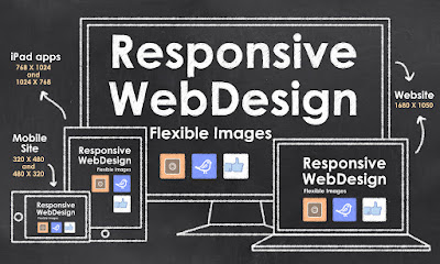
Responsive
web design (RWD) – or mobile-friendly design – is essential these
days. The majority of website visitors browse from their smartphones
or tablets, and web pages meant only for desktops don’t offer a
good-enough experience on smaller screens. However, implementing RWD
isn’t easy, and many website owners end up sacrificing quality or
performance – or both – to make web pages accessible on
small-screen devices.
Here
are some costly mistakes you should avoid while building a responsive
website:
Low-resolution
images
Using
low-resolution images for mobile-friendly web pages is not a good
idea just because visitors will be browsing on a small-screen device.
Every image should be high-quality and be a treat to behold. Nothing
spoils a business’ reputation as much as poor-quality content,
including images.
Cluttered
content
Don’t
create cramped content that has little or no whitespace. Text,
images, and videos should all be easy to see and easy to access.
Minimalist or clean design which makes use of a grid-based layout
should be adopted.
Sacrificing
quality and performance
Mobile
phones, especially low-end devices, don’t have a lot of processing
power and RAM. Because of this, they can’t handle flash content,
videos, and web apps as well as desktop computers. When shifting to
mobile-friendly design, ensure that the content can run well on
devices that have little processing power.
Poor
navigation
Just
creating a miniature version of your regular pages isn't enough –
they have to be designed for touch screens in mind. Often, visitors
are going to be accessing your online presence while they are out and
about and won’t be able to make precision gestures. Icons should be
big and the page easy to navigate even for someone moving.
Not
enough testing
Testing
a prototype or beta testing is paramount on a range of devices,
including tablets and popular smartphone brands. Even if the
prototype renders correctly on a single device, there’s no
guarantee that it will do so on another. Also, most phones and
tablets (and wearable) come in a variety of screen sizes.
By
recruiting the services of an experienced web design and development team, you
can avoid making these errors and provide an improved experience to
mobile visitors.

