5 Mistakes you simply must Avoid with Responsive Web Design

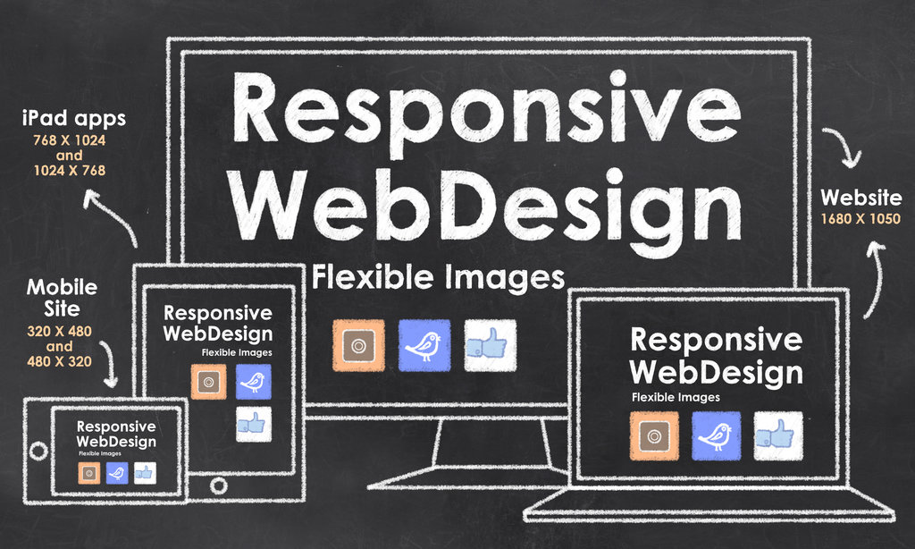
Responsive web design (RWD) – or mobile-friendly design – is essential these days. The majority of website visitors browse from their smartphones or tablets, and web pages meant only for desktops don’t offer a good-enough experience on smaller screens. However, implementing RWD isn’t easy, and many website owners end up sacrificing quality or performance – or both – to make web pages accessible on small-screen devices.

Here are some costly mistakes you should avoid while building a responsive website:

Low-resolution images

Using low-resolution images for mobile-friendly web pages is not a good idea just because visitors will be browsing on a small-screen device. Every image should be high-quality and be a treat to behold. Nothing spoils a business’ reputation as much as poor-quality content, including images.

Cluttered content

Don’t create cramped content that has little or no whitespace. Text, images, and videos should all be easy to see and easy to access. Minimalist or clean design which makes use of a grid-based layout should be adopted.

Sacrificing quality and performance

Mobile phones, especially low-end devices, don’t have a lot of processing power and RAM. Because of this, they can’t handle flash content, videos, and web apps as well as desktop computers. When shifting to mobile-friendly design, ensure that the content can run well on devices that have little processing power.

Poor navigation

Just creating a miniature version of your regular pages isn't enough – they have to be designed for touch screens in mind. Often, visitors are going to be accessing your online presence while they are out and about and won’t be able to make precision gestures. Icons should be big and the page easy to navigate even for someone moving.

Not enough testing

Testing a prototype or beta testing is paramount on a range of devices, including tablets and popular smartphone brands. Even if the prototype renders correctly on a single device, there’s no guarantee that it will do so on another. Also, most phones and tablets (and wearable) come in a variety of screen sizes.

By recruiting the services of an experienced web design and development team, you can avoid making these errors and provide an improved experience to mobile visitors. 

How to Quickly and Effectively Optimize your WordPress Website?

Setting up and running a WordPress site is easy – getting it to stand out in a crowd of almost a billion other sites, though, isn't. It takes time, effort, and a constant stream of updates to build an active, fast-loading, high-performing WordPress website. Here is a collection of simple but useful tips that show you how to drastically enhance the performance of your existing website:
Use a caching plugin
A caching plugin creates static HTML files of your dynamic pages. When a visitor requests a page, the static file is sent to it quickly. That significantly speeds up loading times on both desktops and mobile phones. You can use plugins like WP Super Cache to implement the functionality.
Optimize images
Images take up the bulk of a web page’s size. Some HD images can be as big as a few dozen megabytes (MBs). By compressing images – especially for thumbnail use or previews – you can maximize loading times. If you must show videos, make use of third-party tools like YouTube to host them and embed the link to them in your pages.
Always update to the latest version
Developers are regularly releasing updates to plugins and the platform itself. By staying up-to-date, not only do you ensure your pages load as quickly as possible, but also make your web presence less vulnerable to security threats.
Cut down on the use of plugins
Don’t use more plugins than you have to. Nothing slows down a website like a dozen plugins all competing for bandwidth/screen space. Too many plugins – even if the server can support the demand – place a significant load on a browser.
Embrace minimalist design
Make use of a minimalist design philosophy – like Google’s Material Design. That means make liberal use of whitespace, arrange content in a grid-based layout, and never stuff a single page with too much content – use multiple pages instead.
The tips mentioned here can improve load times by a couple of seconds – or even more – depending on your existing setup. If you want a truly professional, high-performing website, though, you should consider hiring a professional WordPress development team to upgrade your web pages at an affordable rate. 

Why is Mobile-Minded Web Design the Most Effective Approach?

Only a few years ago, web designers had to build websites solely for desktop users. After that came mobile phones, which prompted designers to make responsive websites that could be displayed properly on both desktops and mobiles. Recently, though, the majority of internet traffic has begun originating from smart-phones. Designers have taken notice of this trend and have embraced the ‘mobile-first’ approach. Should you follow suit?

Mobile-first vs. Mobile-minded

There is nothing wrong with the mobile-first design. It refers to the practice of creating content with small-screen users in mind. However, this practice is often to the detriment of the desktop experience. Not only are mobile-first sites somewhat basic and bare-bones, but they also lack access to advanced functionalities that some types of businesses need (like online retailers). Instead, we recommend building web pages with both mobile and desktop users in mind, without compromising the customer journey on either platform.

Best practices to follow

Here are some best designing practices that will help you craft pages that will provide a great user experience (UX) on both platforms:
  • Streamlined navigation: Make your menu simple to tap/gesture through and structure your pages logically. If you are planning on making money from your site, the payment process needs to be heavily optimized too.
  • Simple CTAs: There should be a large number of CTAs placed in strategic locations throughout your pages. These CTAs should be big and have easy to read text on them, which helps phone users tap them without errors while they are on-the-go.
  • Lazy loading: It’s hard to navigate on the phone. With lazy loading and other scrolling options, though, it’s possible to load multiple pages quickly and easily by just swiping the page upwards.
  • Minimal typing: To improve the mobile experience, make sure you don’t need visitors to type more than a handful of lines. If you are going to include forms, make them short and straightforward.

By embracing the mobile-minded web design approach, not only will you keep smartphone users happy, but also improve conversion rates. You can get it implemented affordably by outsourcing the project to an experienced web development team.  

Common Pitfalls to Avoid While Creating a Magento Store

Getting a business settled online these days can be tough. Not only is the market over-saturated, but retail giants like Amazon.com also have marketing budgets that small business owners just can't match. If you’re planning to launch a new shop, you can still succeed, though. Just ensure the online store you’re building can provide an outstanding user experience to visitors. If you make shopping with you an enjoyable experience, you can turn visitors into recurring loyal customers.

If you’re using Magento, here are some costly rookie mistakes you need to avoid:

Using default settings

Are you planning on using default descriptions for your products? Your store will take a nosedive in Google’s search engine rankings. Your store will have to be extensively customized for your business. It will also be a long-term effort - it takes anywhere from 6 months to a year to gain significant rankings.

Huge loading times

There’s no faster way to lose customers than to have web pages that take more than 5 seconds to load. Ideally, customers expect a page to load in under 2 seconds. Using layered navigation can make your site more accessible, but it negatively affects loading times. Strike a balance instead.

Terrible themes

Don't use a theme you like – use an idea your shoppers will like instead. There are plenty of free theme choices in the Magento store. Don’t use a stock theme, though, unless it’s right for you. Customize your store instead to get it to stand out.

Designing only for desktop users

The majority of the traffic (and, in some cases, over 70%) to popular eCommerce stores worldwide originates from mobile phones. If your eCommerce site isn’t designed to be responsive – or mobile friendly – you’re going to lose out on a lot of revenue.

It’s also a good idea to get private hosting, even if it’s a bit more expensive. Shared hosting can negatively affect store performance, especially during peak hours. You can improve your chances of building a great store by hiring developers who have made successful ones in the past. Dedicated Magento developers can be hired short-term or long-term at affordable prices.

Artificial Intelligence Will Shape the Future of eCommerce


Artificial intelligence isn’t just a concept confined to science fiction books anymore. AI, in admittedly limited formats, has found its way to our daily lives. Smartphone voice assistants like Siri and Chatbots in messaging applications are already providing us with information and helping us make informed decisions. 


Application of AI in eCommerce

Everybody knows that online shoppers have very limited attention and very high expectations. According to research, over 40% of all customers will leave a website if a page doesn't load in under 3 seconds. Nobody has the time to wait around for very long these days. AI technology is now being used to not only help customers shop faster, but also improve their visiting experience.

Here are some of the top applications of the technology in the world of eCommerce:

Product Consultant: Virtual shopping assistants will be able to help consumers find products they are after easily. They will also be able to explain product details without getting the facts wrong or forgetting anything, in pure human language.

Communicators: Shopping will be much faster and easier with the help of voice-based commands, to which the AI program will process and respond.  

Customer service: Chatbots are already helping many e-commerce businesses streamline their customer service. Not only do users get help faster, but the business also saves on workforce costs. 
Visual search: With the help of smartphone cameras, it will soon be possible for buyers to point at a product and get pricing and other information about it.  

Why is AI useful?

By implementing machine learning and other functions on your website and m-commerce apps, your business will be greatly benefited. You will be able to:
  • Bring down operational costs greatly
  • Sell faster and better
  • Engage customers with personalized services
  • Provide the personal touch

Store owners that don’t use the technology will, of course, fall behind their competitors. The world of e-commerce is a hyper-competitive and mainstream adaptation of artificial intelligence has already commenced. Interested in how AI can help your unique business? We recommend you consult with an experienced eCommerce development team - like Openwave’s - to find out. 

Best PHP Coding Practices to Follow to get Outstanding Results

PHP is the most popular programming language out there, and it is a favorite with developers worldwide. However, despite its popularity, many developers don’t follow best coding practices while working with the language – because they don’t have the time to learn them because it’s too much hassle, or because some don’t know they exist. By following best practices, though, you can build code that is easy to parse, debug, and modify – even by third party developers that are being brought in later to work on the project.

Here are some best practices that let you build outstanding software and save a lot of time in the long run:

Come up with a coding standard

When multiple team members are working on a project, a coding standard must be followed to make the program understandable for other team members. Don’t write code only you would understand.

Use adequate indentations, white spaces, and line lengths

When you write words on a page, you make sure they are legible and evenly spaced. You also break up words with paragraphs. When it comes to PHP coding, many developers fail to use adequate indentations, white spaces, and line lengths to make the code legible and stand out.

Never use functions inside loops

Using a function inside a loop may save you some coding time, but it slows down the performance of the app or website you’re making. Fast performance is crucial to today’s audiences, so never use functions inside loops.

Turn on error reporting

If you can spot errors while coding, you won’t have a lot of trouble when you test and debug your program later. Always turn on error_reporting() to spot errors as they happen.

Don’t Repeat Yourself (DRY)

Duplicate code is unnecessary, and redundancy decreases the quality of the final product. Follow the DRY best practice wherever possible.

Refer to the PHP manual

Always refer to the official PHP manual if you’re stuck somewhere or don’t know what a function does. The official resource is vast and chock full of information on how to build a great product.


If you are just starting out with learning PHP, it’s highly recommended that you follow these guidelines from the very beginning if you want to be an excellent developer.  

5 Reasons to Move Your Online Business to the Magento eCommerce Platform

Do you own an online website that you’re making money from? The ultimate goal of every online shop is to find interested parties and convert them into paying customers. The Magento eCommerce platform was designed exclusively to allow you to build outstanding online stores that provide a high level of user experience (UX) to visitors. It is used by over 500,000 highly successful businesses worldwide at the moment, and the number keeps increasing.

Why should you move to Magento?

There are a large number of advantages to moving to this platform. Here is an overview of some of the top ones:

Provide a high-quality shopping experience

Magento pages load lightning quick, thanks to a server page caching feature (and other features). You can also extensively customize your store and add an extensive array of advanced functionalities to it without breaking a sweat. All this contributes to building a shop that looks good and is a joy to shop on.

Make your store accessible on mobiles

Magento supports responsive design by default. As the bulk of your customers will probably want to shop on your store – or at least browse it – on their phones, owning a mobile-friendly shop is an easy way to boost revenues.

Make a shop that grows as your business does

Magento stores have no product limits. That means you can build as big a store as you want. Also, you won’t have to spend time building a new store if you’re looking to expand – the platform is fully scalable and will grow (or shrink) with your business, saving you a lot of resources in the long run.

Your store will be cheap to run and maintain

The platform is fully open source. That means you don’t have to pay a dime to use it or modify it. Also, finding hosting for Magento is very easy, since it’s a popular platform. Most hosts won’t charge you a lot of money per month to host your business.

You can hire developers for cheap

Magento enjoys a solid backing by experienced developers from around the world. If you’re not tech-savvy, you will need to hire dedicated Magento developers once a year to redesign and revamp your store and fill security holes.